


logotype for interior designer and architect.
russia, grozny
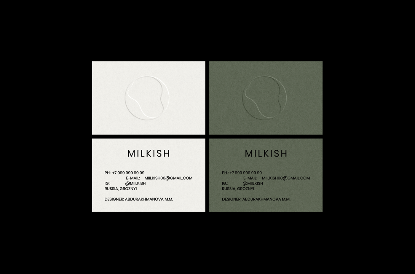
the core is the center, the basis of the existing thoughts, principles, views, approach to work, creativity. it changes in size, increases with time, creates new stable principles, beliefs, moves along bends, absorbing new thoughts, knowledge.
the form of the sign is alive, there is fluidity in it, it gradually fills itself — a metaphor for how knowledge, acquired experience form a personality from the inside, doing it very smoothly, gradually.
green is a sign of environmental friendliness, sanity and reason.
2022
logotype: evgenia prokopieva
logotype: evgenia prokopieva
thanks for watching
for more information check my instagram
for more information check my instagram


